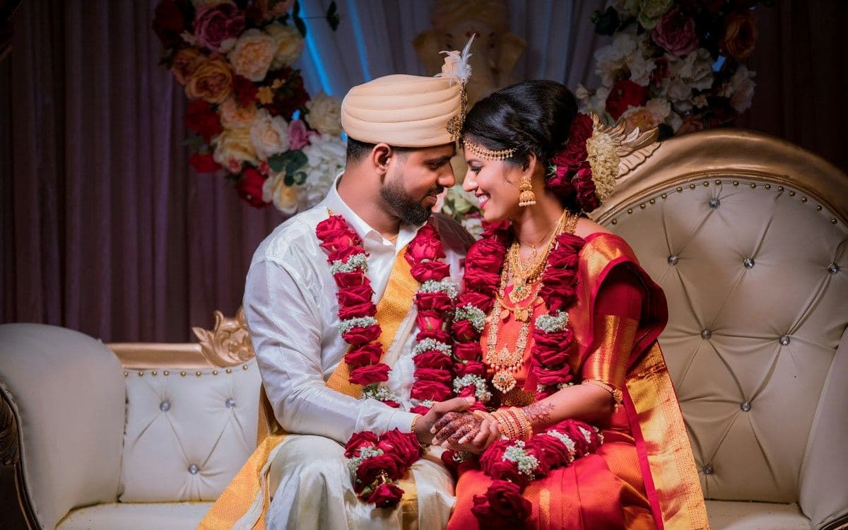
Minimal wedding invitations are harder than ornate ones, because there is nothing to hide behind. An elaborate design can carry a weak layout; a minimal one cannot. Every spacing decision is visible. There is also a specifically Indian tension here. Minimal design signals restraint and contemporary taste, but an Indian wedding invitation still has obligations — both families named, the ceremony properly described, elders addressed. Minimalism done carelessly reads as omitting people, which is a different message from the one intended. Here is how to design a genuinely minimal invitation that still does everything an Indian invitation has to do.
What minimal actually means here
Minimal is not the same as sparse. It means every element earns its place, not that elements are deleted.
An invitation that removes the parents' names to look cleaner has not become minimal; it has become incomplete, and in most Indian families it will be read as a slight. The same applies to dropping the invocation or compressing the ceremony schedule into one line.
What minimalism should remove instead: decorative borders that do nothing, background patterns behind text, drop shadows, multiple accent colours, three typefaces where two would do, and photographs used as texture rather than content.
The test is whether removing an element loses information or loses noise. A gold filigree border loses nothing. A parent's name loses a great deal.
Done properly, a minimal Indian invitation carries the same information as an ornate one and simply presents it with more air and less ornament.
Space is the design
In a minimal layout, the spacing does the work that decoration does elsewhere, which means the spacing has to be deliberate rather than default.
Group related information tightly and separate unrelated information generously. The date and time belong close together; the venue block should sit clearly apart from them. Guests read groupings before they read words, and correct grouping is what makes a sparse layout feel organised rather than empty.
Be consistent. If sections are separated by a given amount of space, use the same amount everywhere. Inconsistent spacing is invisible when there is ornament to distract from it and glaring when there is not.
Give the names room. On a minimal invitation the couple's names are the single focal point, and crowding them with a date immediately below undercuts the whole approach.
Do not fill space because it looks empty. Empty space on a minimal invitation is the point; the instinct to add a motif is what turns minimal into merely plain-with-decoration.
A restrained palette
Minimal invitations usually work best with two colours and one accent, and on screens the choices narrow further.
Off-white or warm ivory background, a dark warm grey or deep brown for text, and one accent — a muted gold, a sage, a terracotta — used for a rule, a heading, or the directions button.
Avoid pure black on pure white. It is technically the most minimal and it reads as a document rather than an invitation. A very dark brown on ivory is warmer and equally legible.
Resist the urge to make the accent subtle to the point of invisibility. A pale accent on a pale background is not restraint; it is a contrast failure, and it disappears entirely when a guest opens the invitation outdoors.
Use the accent sparingly and consistently — ideally for the one action you want guests to take, which on most invitations is opening directions.
Where minimal invitations go wrong
Four recurring failures.
Too little information. Guests still need the schedule, the specific hall, parking and a map. Minimalism applies to visual treatment, not to content. An invitation that omits the schedule to look clean generates the messages the invitation was meant to prevent.
Type too small. Minimal designs tend toward small, light type, which fails for older guests on phones. Keep body text at 16 pixels or above and avoid light weights.
Thin rules that vanish. Hairline dividers at one pixel often disappear on lower-density screens. Use something with a little weight.
Excessive centring. Every line centred on a long page makes the text hard to scan, because the eye has no consistent starting point. Centre the names and the headline; left-align the schedule and the address.
Quick checklist
- Keep every obligation — both families, invocation, full schedule
- Remove ornament, not information
- Group related details tightly; separate unrelated blocks generously
- Use consistent spacing throughout
- Two colours and one accent; avoid pure black on pure white
- Keep body text at 16px or larger, and avoid light weights
- Avoid hairline rules that disappear on low-density screens
- Centre the names; left-align schedules and addresses
Frequently asked questions
Deliberate spacing and a restrained palette, with every obligation still intact. Minimal means removing ornament — borders, background patterns, shadows, extra typefaces — not removing information. In a sparse layout the spacing does the work decoration does elsewhere, so it has to be consistent and considered rather than left at defaults.
Yes, provided minimalism is applied to the visual treatment rather than the content. Both families’ names, the invocation and the full ceremony schedule should stay. Removing the parents’ names to achieve a cleaner look is the most common mistake, and in most Indian families it reads as excluding the people hosting the wedding.
An off-white or ivory background, dark warm grey or deep brown text, and one muted accent such as gold, sage or terracotta used for a rule or the directions button. Avoid pure black on pure white, which reads as a document rather than an invitation, and avoid making the accent so pale that it disappears outdoors.
Type that is too small or too light for older guests on phones, hairline rules that vanish on low-density screens, centring every line so the text is hard to scan, and cutting genuinely useful information — the schedule, the specific hall, parking — in the name of looking clean.