Royal invitation design draws on a specific visual vocabulary — the palace card, the Art Deco border, the deep jewel tone and antique gold. It is the most popular register for Indian wedding invitations and the easiest to get wrong, because the line between opulent and cluttered is thin. The most common failure is additive: a gold border, plus a motif, plus a script, plus a textured background, plus a monogram, plus a foil effect. Each element is fine; together they compete, and the couple's names disappear into the decoration. Here is how the royal style works, and how to keep it grand without losing legibility.
The vocabulary and where it comes from
The royal register in Indian invitations borrows from a few identifiable sources, and knowing which you are drawing on keeps a design coherent.
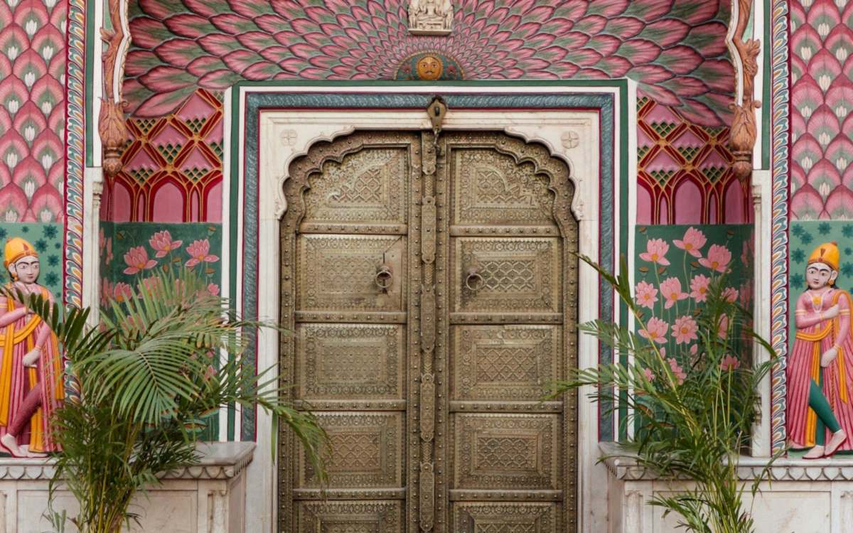
Rajasthani and Mughal court motifs — jharokha arches, jaali screens, paisley and floral borders. These carry warmth and are strongly associated with North Indian weddings.
Art Deco and palace-hotel styling — symmetrical geometry, stepped forms, strong verticals in gold on navy or black. This is the register of the 1930s princely states and reads as more restrained and more modern.
South Indian temple architecture — gopuram silhouettes, kolam patterns, deep red and gold. Distinct from the Mughal vocabulary and appropriate for a different set of ceremonies.
Choose one and stay in it. Mixing a jaali border with Art Deco geometry and a temple silhouette produces something that reads as generically ornate rather than deliberately regal.
Making gold work on a screen
Gold is central to the royal look and it behaves badly on screens, because on paper it is foil catching light and on screen it is a flat mid-tone yellow-brown.
Use gold for ornament, borders, rules and large headings — never for body text. Gold on cream is the single most common legibility failure on Indian invitations, and outdoors it effectively disappears.
A gradient rather than a flat fill helps considerably. A gold that shifts from a deeper bronze to a lighter champagne across a shape reads as metallic in a way a flat colour never does.
Gold on dark backgrounds works far better than gold on light. Antique gold on deep navy, maroon or near-black carries genuine richness and gives enough contrast for larger text to be legible.
Keep body text out of the gold entirely. On a dark royal palette, use a warm off-white or a pale champagne for paragraphs and reserve gold for the decorative layer.
Dark palettes without losing readability
Royal designs are frequently dark, and dark backgrounds carry specific risks on phones.
Body text on a dark background should be an off-white rather than pure white, which glares at night, and it needs a slightly larger size and a slightly heavier weight than the same text on a light background. Light text on dark reads thinner than it measures.
Give dark designs more line spacing. Text on dark backgrounds is harder to track line to line, and generous leading compensates.
Watch the schedule block in particular. A ceremony schedule set in a light weight on a dark maroon background at 14 pixels is where royal invitations most often become unreadable, and it is exactly the block guests return to.
Test at low screen brightness. Many guests read invitations at night with brightness turned down, and a dark design that looks dramatic at full brightness can become an unreadable near-black rectangle.
Keeping ornament in its place
The discipline that separates a grand invitation from a cluttered one is restricting ornament to the edges and the headings.
Borders belong at the frame. Motifs belong at section breaks and corners. The centre of the composition — where the names, date, venue and schedule live — should be comparatively plain, because that is where reading happens.
Never place a pattern behind body text. A jaali or paisley texture behind a paragraph destroys legibility even at low opacity, and it is the most frequent single mistake in the royal register.
Use one ornamental motif and repeat it at different scales rather than introducing several. Repetition reads as a design system; variety reads as indecision.
Symmetry carries a lot of the regal feeling on its own. A perfectly symmetrical layout with a single well-drawn border often reads as more expensive than a busier design with five decorative elements.
Quick checklist
- Choose one visual vocabulary — Mughal, Art Deco or temple — and stay in it
- Use gold for ornament and headings, never for body text
- Prefer a gold gradient over a flat gold fill
- On dark backgrounds use off-white text, slightly larger and heavier
- Give dark designs more line spacing
- Never place a pattern behind body text
- Keep ornament at the edges; keep the centre plain
- Test at low screen brightness as well as full
Frequently asked questions
Committing to one visual vocabulary — Mughal and Rajasthani motifs, Art Deco palace styling, or South Indian temple forms — and keeping ornament at the edges while the centre stays plain. The common failure is additive: a border plus a motif plus a script plus a texture plus a monogram, each fine alone, together burying the couple’s names.
Use a gradient rather than a flat fill — gold that shifts from bronze to champagne across a shape reads as metallic, where a flat yellow-brown does not. Use it for borders, ornament and large headings only, and place it on a dark background rather than a light one. Gold body text on cream is the most common legibility failure on Indian invitations.
Use off-white rather than pure white for body text, set it slightly larger and heavier than you would on a light background, and increase line spacing — light text on dark reads thinner than it measures and is harder to track line to line. Test at low screen brightness, since many guests read invitations at night with brightness turned down.
No. A jaali, paisley or floral texture behind a paragraph destroys legibility even at low opacity, and it is the single most frequent mistake in this style. Keep patterns at the frame, at corners and at section breaks, and leave the area where guests actually read comparatively plain.